skip to main |
skip to sidebar
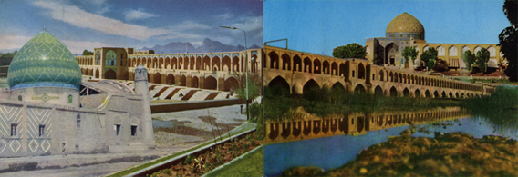
I started by thinking about absence, demolition of buildings, disappeared architecture, which is one of the main impulses behind the Chahar bagh collages. In these images here , in real life,the structures are still standing of course (Damavand, Persepolis, different beautiful mosques) but there's an imagining of landscape with their loss.I've been playing with postcards and pattern and colour. A bit excessive, but I tend to try pushing pattern to the maximum and then pull back a little. Perhaps there is further still to go?
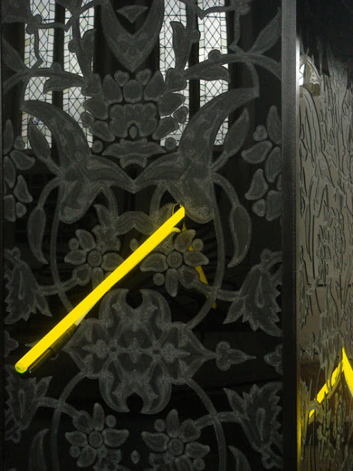
I've finally got hold of a postcard of the fabulous tomb of Cyrus the Great, once set within what may be considered the first four-quartered garden or chahar bagh. I've sneaked some streaks of neon yellow onto the image, for a direct comparison with my sculpture, "The House is Black" from a couple of years ago. The form of this was, of course, based on Cyrus' tomb.
the tomb is at Pasargadae.
A brief mention of the plan to build the Sivand Dam somewhere between Pasargadae and Persepolis - a somewhat controversial proposal due to the unreliability of the flood plain level and also the increased humidity levels that experts believe will accelerate the destruction of Pasargadae - a UNESCO World Heritage Site.
I've amassed a new pile of postcards for collage purposes and have just started to play around with their possibilities. I'm still interested in the immediacy of scissors/scalpel and glue and the almost crass butting together or butting against of the monumental architectural structures. However, the research I was doing with Nicola Naismith last month into East Anglian UFO sightings has awakened an alarming 1980's fascination in all that is fluorescent. (It all started in Rendlesham Forest, with the fluorescent spraypaint markings on the trees.) This perhaps should have been unsurprising to me given my long interest in neon light (and the inability to afford to use it much), but the fluorescent thing has taken me by surprise. I suppose my being drawn to 'nasty' yellow hues over the last couple of years should have been a clue??
Anyway, I will be experimenting with the nasty yellows and nasty greens and nasty pinks for a while, predictably, about ten years or so after everyone else 're-discovered' them. These images show the first, modest appearance of fluorescent green in the postcard collages.
The images are top to bottom: 'Double Bridge' and 'Poet's Garden'.


.jpg)


